

Our project began with an exciting assignment from Staatstheater Augsburg. As part of their digital initiative, they ship VR headsets to customers’ homes, allowing them to experience specific plays virtually. For the Frida Ballet, our task was to design a unique souvenir for customers who rent these headsets.
The goal was to create a physical object that serves as a keepsake while incorporating digital elements to offer a compelling mixed-reality experience. This page outlines our process to bring this idea to life, from understanding the target audience to crafting and refining the final product.
Identifying Target Audiences
To ensure we design something truly useful for the people who will actually use it, we began by creating personas for the project. Through multiple iterations and rounds of feedback from the client and our professor, we refined our approach and finalized two personas: primary and secondary. These personas, shown in the pictures below, guided us in understanding our target audience's needs, preferences, and behaviours.


Defining Context of Use
After successfully identifying our target audiences, we moved on to mapping out the context of use for the product. This step was essential to understand when, where, and how users would interact with the souvenir. By visualizing the different scenarios in which the product would be used, we ensured that it fits seamlessly into the user experience while complementing the mixed-reality elements of the project.
After discussions, we developed one main context of use, as shown in the picture below.

Mapping User Flow
We then created a user flow to visualize how users would interact with the product, ensuring a smooth and intuitive experience. While we had many ideas and features in mind, the 10-minute usage context required us to streamline the content. After three iterations, we refined the flow to balance functionality and feasibility, aligning it with user expectations.
Below are images showing the evolution of our user flow from the first draft to the final version.


Creating Hypotheses
The next step was to define hypotheses to refine the product's details. We identified the most critical features and then formulated hypotheses around them, specifying clear outcomes and success criteria. This approach provided a structured framework to guide our design decisions and evaluate their effectiveness.
Below is an image showing the hypotheses for the most make-or-break features we brainstormed.

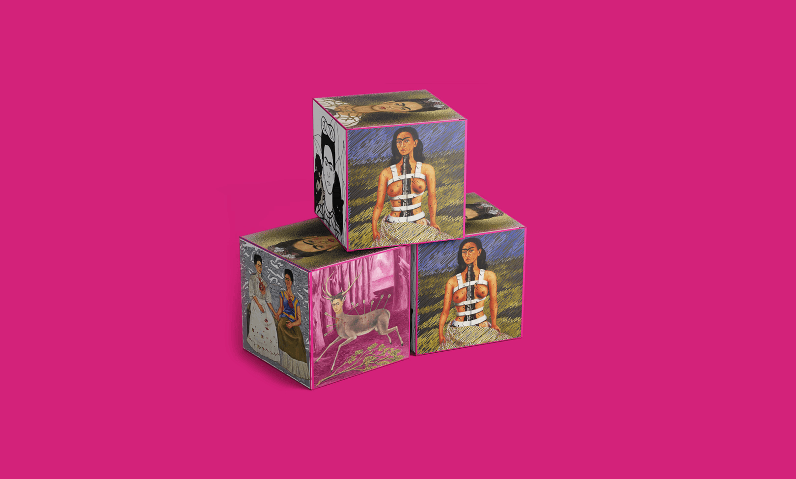
Prototyping a Minimum Viable Product
To test our hypotheses, we developed a minimum viable product (MVP) focused on two key areas: size and weight, and how users interact with the object.
For the size and weight hypothesis, we created multiple prototypes of cubes in different dimensions: 5 cm, 7 cm, and 6.8 cm, using paper with varying weights ranging from 100 mg to 300 mg. This allowed us to explore the optimal balance between usability and physical properties.
To evaluate user interaction, we built a prototype for scanning the side wall and viewing the 3D effect. This was implemented using Unity and Vuforia, enabling us to simulate and assess the interaction experience effectively. Additionally, a prototype for the interactive painting feature was developed using ProtoPie, allowing us to experiment with dynamic engagement possibilities.
Conducting User Tests
With the prototypes ready, we began conducting user tests to validate our hypotheses. Users were provided with the prototypes and encouraged to explore them without instructions, allowing us to capture their most natural behaviours and interactions.
Through their feedback and our observations, we revisited the hypothesis phase to assess what worked, what didn’t, and what required further refinement or testing. This iterative approach ensured our designs aligned with user expectations and uncovered valuable insights for improvement.
Testing the Size and Weight
We brought various cube prototypes to class to evaluate the size and weight hypotheses, allowing our peers, professor, and client to select the most suitable option. The winning prototype was 6.8 cm with a weight of 350 gsm, deemed optimal for usability and practicality.
To further validate these results, we tested the prototype with individuals from our target audience's age range. Participants were asked to assess whether the size and weight were comfortable and if the folding process was straightforward. Their feedback indicated that while the size and weight were appropriate, some users struggled with folding—either folding the cube incorrectly or being unable to fold it at all.
In response to this feedback, we refined the design by adding visual indicators to distinguish visible and non-visible parts of the cube. This gave users clear guidance during the folding process, improving usability and reducing errors.

Testing User Interaction with the 3D Content
To test user interaction, we provided users with the prototype built in Unity and asked them to scan the cube with their phones to explore the augmented reality (AR) content. All participants could scan the cube easily and view the 3D content in AR.
The responses were generally positive, with most users expressing enthusiasm about the ability to listen to music while viewing the 3D art. However, some feedback suggested adding subtle animations or a timelapse video to the 3D content to make the experience more dynamic and engaging. This valuable input has informed the next steps in enhancing the user experience.

Testing User Interaction with the Interactive Painting
We provided another set of users with the ProtoPie prototype to evaluate the interactive painting feature. The testing aimed to observe how people interact with this feature and gather their initial impressions.
The results showed that users were fascinated by the concept and found it engaging. However, since the prototype was not fully functional, some users found it challenging to understand without guidance. Feedback also provided valuable insights into user interaction preferences—most participants naturally clicked on elements rather than swiping or holding to focus, highlighting key considerations for refining the feature.

Future Plans
With the valuable feedback we have received, our next step is to refine the product further and plan additional user testing in the upcoming semester. These tests will focus on the entire user journey, from receiving the cube to fully interacting with its content.
We believe that iterative improvements, guided by user feedback at every stage, will ensure the product evolves into a user-centred and impactful experience.